Test Results Platform
EverlyHealth provides DTC home lab testing. At the time of my tenure, EVerlyHealth was a series B startup. I led design of Everlywell's results platform and associated touchpoints from purchase to post-results follow-up to help drive NPS through increased service transparency, consumer understanding, and delight.
The challenge
NPS scores for everlyhealth’s test result platform were low. Leadership believed that their legacy results platform and UI were the main culprit that took away from the holistic brand experience they aimed to create. As such, everly turned toward user experience design to further understand experience issues and drive forward meaningful improvements in the product experience.
A secondary challenge in the role was trying to bring design thinking and a user-centered approach to Product. As Everly’s first UX director, I knew that relationship building, socializing approaches to UX while including others collaboratively, and championing the voice of the consumer would be essential to being able to build trust in the approach to improving NPS scores.
Another secondary challenge was player-coaching - simultaneouesly conducting the duel role of design evangelist, process creator, and people manager for 3 designers, 2 of whom I hired.
Collaborative Research Strategy
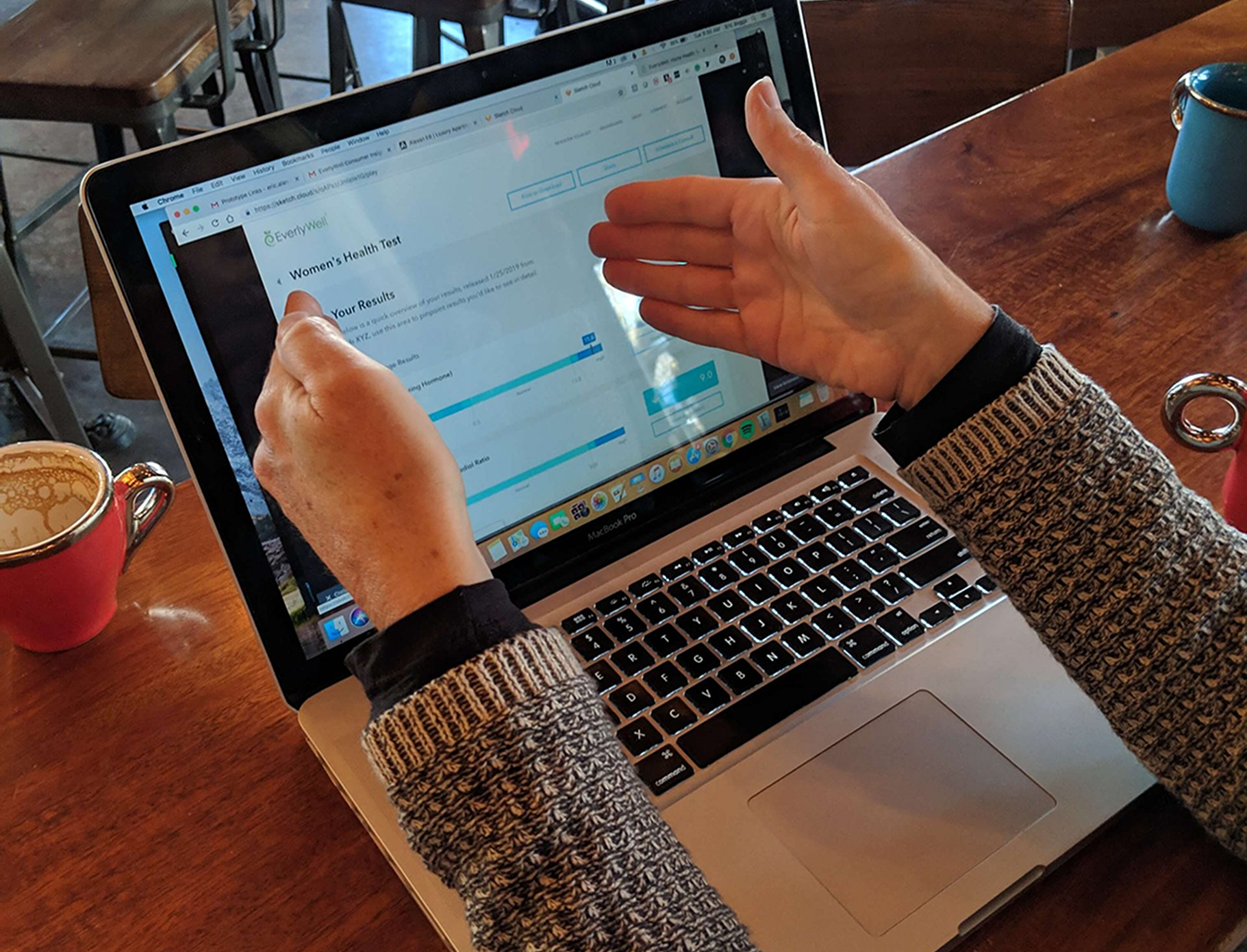
Involving leadership in user testing
The Chief of Staff conducts a think-aloud user test, grounding her in the design and enabling her to contribute to the product’s evolution.
Socializing user stories
I interviewed many everlywell consumers after their results experiences in learn from them on how we could improve. In order to disseminate those stories, I would post them in office; create scannable QR codes linking to audio files; share out biweekly summaries; and present in front of the entire company.
As the test results platform upgrade was the primary directive, I started there. I needed to build empathy with users and connections with fellow colleagues in order to demonstrate value as fast as possible. The easiest way to do this was through setting up a rigorous user testing and think-aloud protocol to enable employees, consumers, and potential consumers (intercepts! remember those!?) to provide feedback on early stage directions for the new platform - then summarize decision making for chosen directions based on preferences.
Winning through rigor
We used Air Table to document preferences for lab result views, then aggregated overall perspectives to help move towards a de-risked UI choice. The rigor we applied to testing was novel and when presented to leadership was well received.
UX Direction
Final Polish
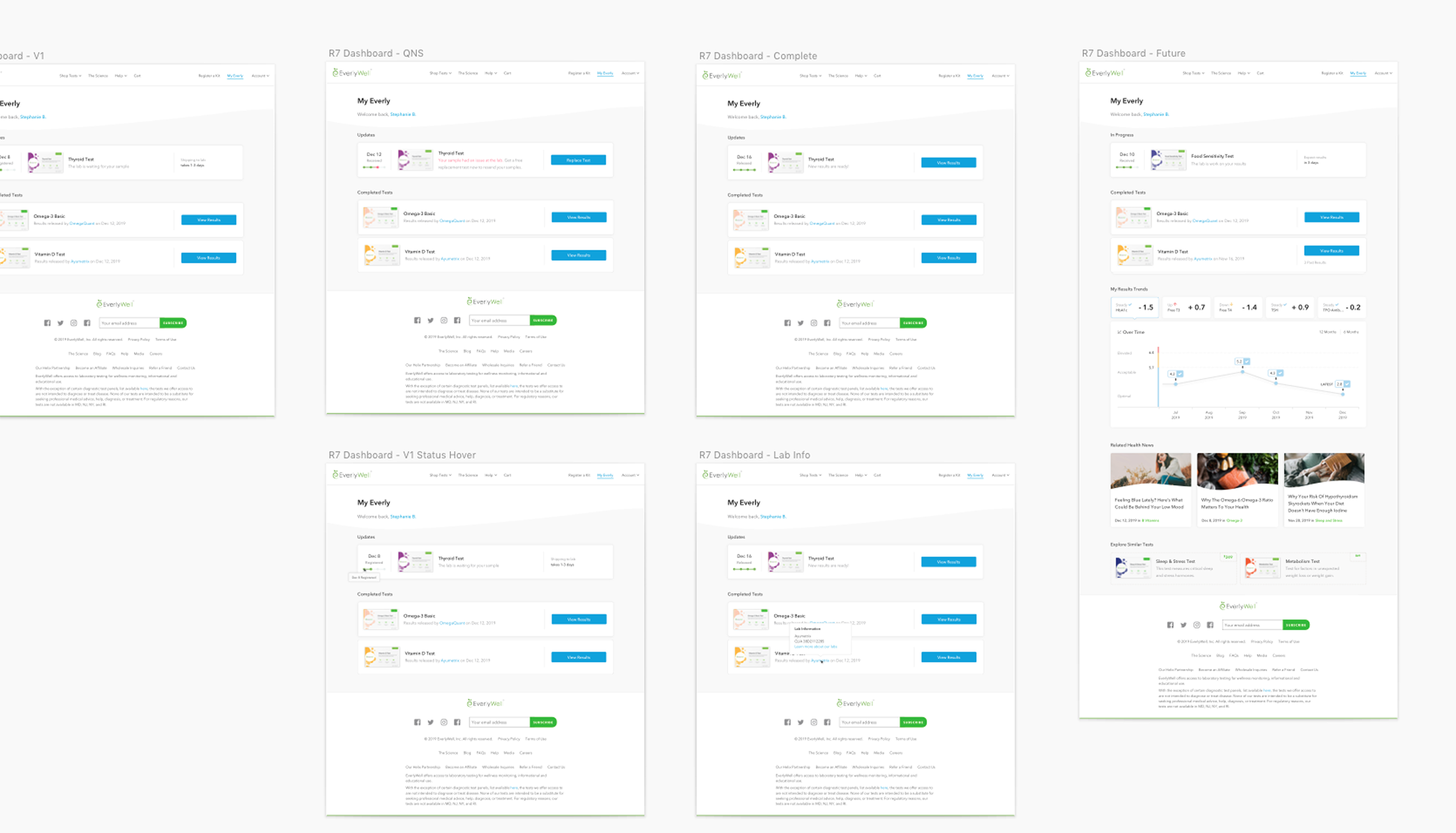
I oversaw work of our two visual designers, facilitating critique and ensuring we provided a consumer-grade lab results experience.
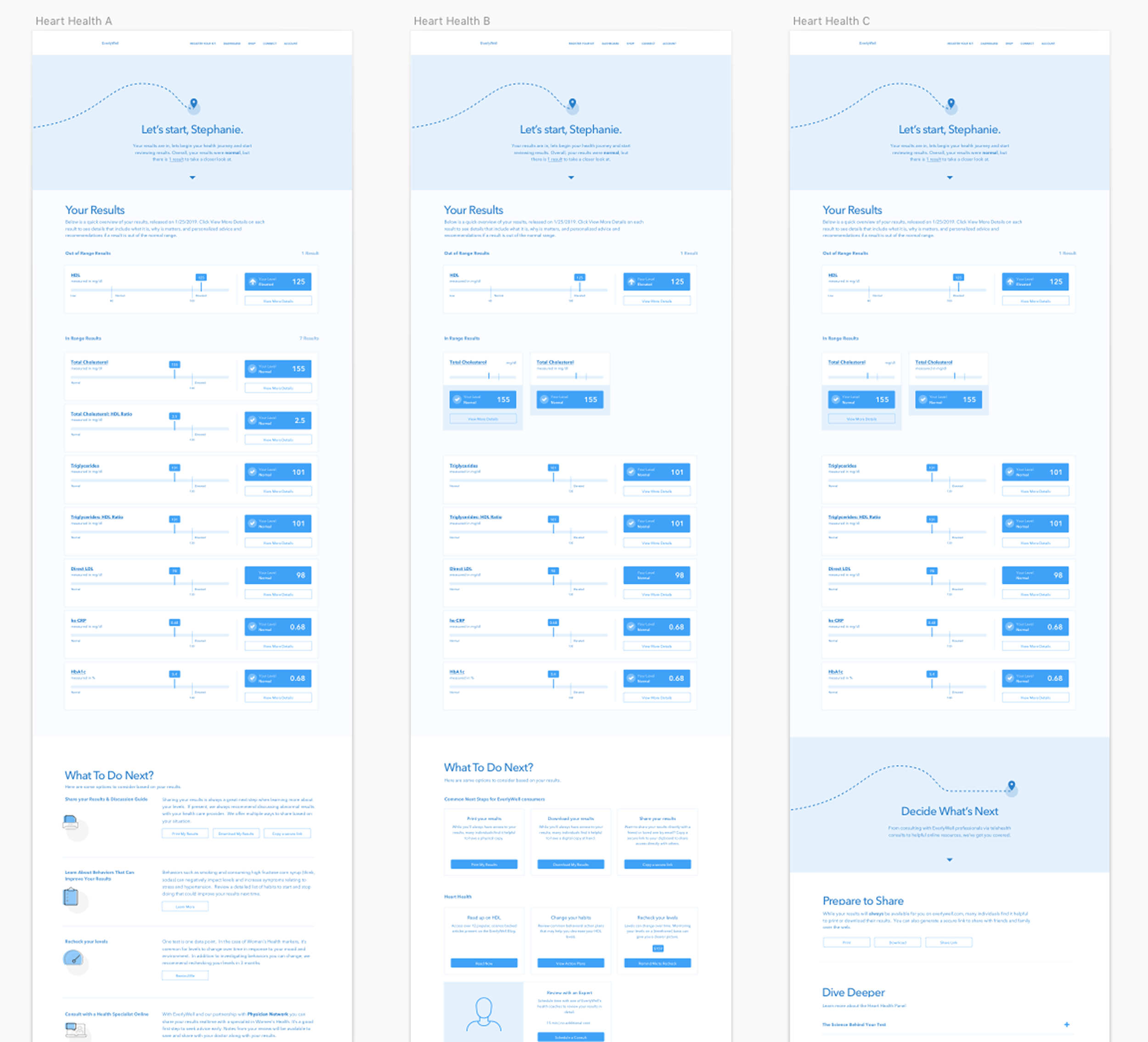
Initially, I created all results platform wireframes, built prototypes in Invision, and once features were de-risked through user testing, I would work with the visual designer under my direction to move them into high-fidelity designs with Redlining in Sketch.
Over my first 6 months, I helped recruit and hire a second visual designer and a design researcher to support and enhance our process.
As a team, we conducted daily standups, weekly 1v1s, and weekly critique sessions to further build camaraderie and craft.
Wireframming and Test Result Direction
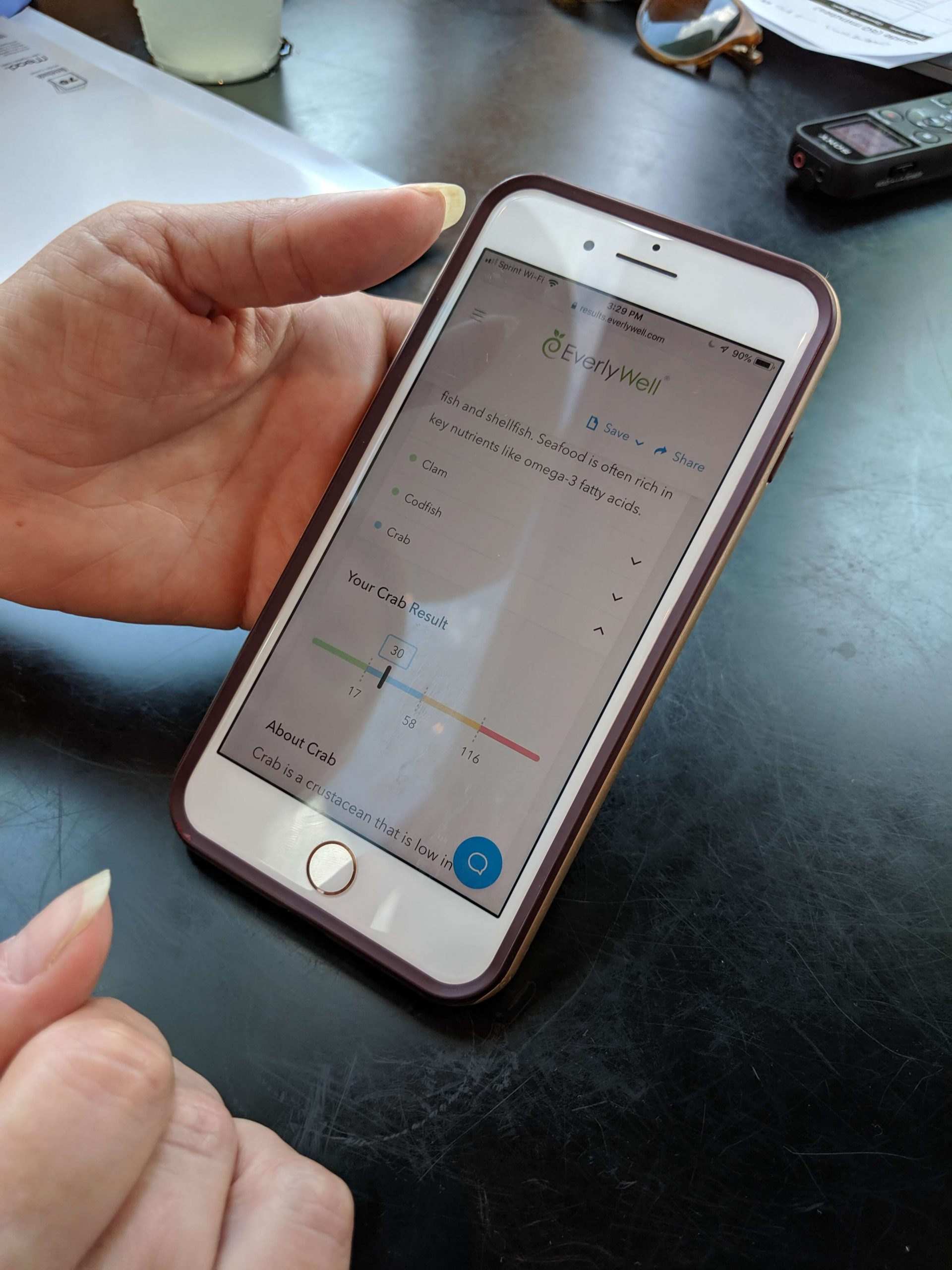
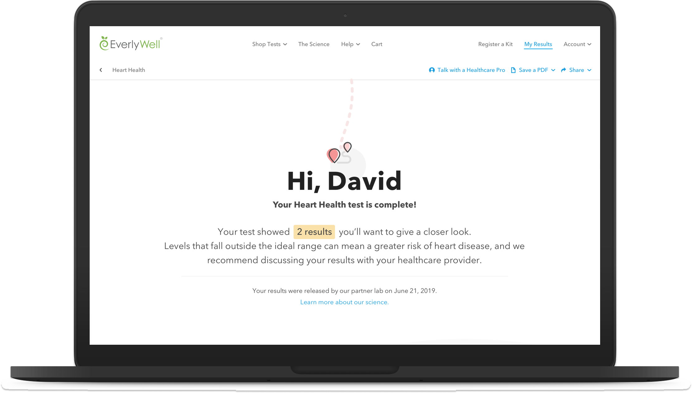
Through wireframming and user research, we found similarities in needs of consumers at the critical moment of receiving a result: carefully introducing an overrall summary of a test without inducing fear.
Providing descriptions of lab result analytes, and connecting values to potential symptoms.
Giving clear indications of normal, abnormal, and trending.
Helping consumers to prepare for what’s next - what to do with test results across our panel types to make them actionable.
Expanding Beyond the Result
Both our qualitative research with consumers and quantitative analysis indicated that for each test, there were also opportunities to improve comprehension and delight.
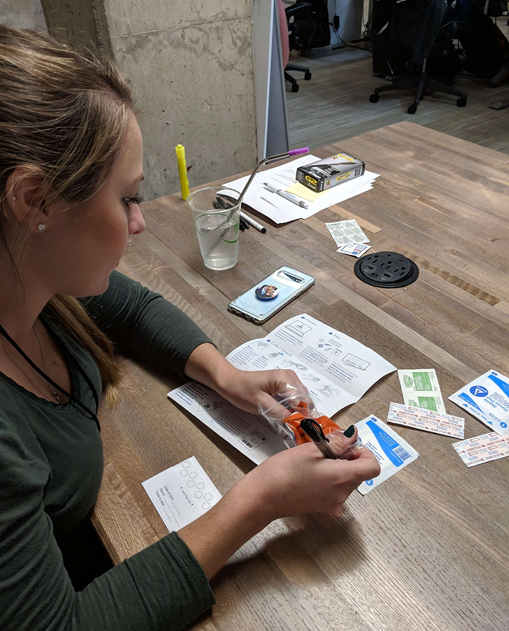
Email communications did not clarify well how to prepare for each test, and a subset of kits were never used. Worse, our numbers for kits marked insufficient for specimen/blood collection were high, creating confusion and frustration for many.
I worked closely with a cross-functional team of marketers, operations professionals, and our design team to further enhance marketing communication along the consumer journey and to redesign the specimen collection results.
Results
Within one year’s time, our efforts drove significant results for the business.
+50 NPS: Roughly, we moved our score from 0-20 (depending on test) to between 50-70.
-10% decrease in patient lab specimen collection issues.
Informing high-quality execution with rich consumer insight is a recipe for success.


